Responsive Web Design Trend For 2020
Are you curious to know what responsive Web Design trends will be for 2020 ? Here is an overview to keep an eye on: it will be useful to update you and have an attractive website, which gets more engagement . Or to achieve success as a freelance graphic designer in the coming year.
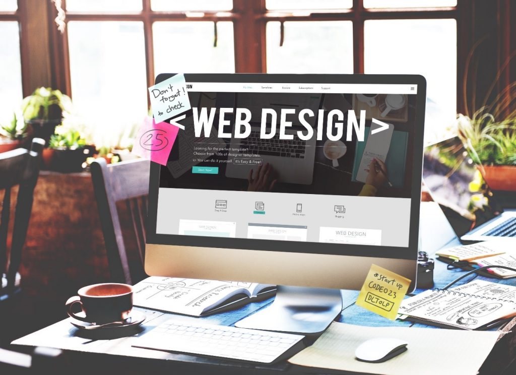
What is responsive Web Design and why use it
Are you a novice Graphic Designer , or do you have a website to enhance and where visitor traffic does not take off? Responsive Web Design can help you, but first find out what it is and why use it! The short abbreviation RWD indicating it was coined by Ethan Marcotte in 2011; is a technique used to build websites that automatically adapt their graphics to the display device.
The RWD starts from the concept that the same contents are displayed differently, for reasons of pixel and size of the display, on computers, tablets, smartphones , mobile phones and web TVs. So the responsiveautomatically optimizes the visualizations, avoiding complicated maneuvers to enlarge or reduce the contents.
Obviously, under these conditions, users are much happier to surf. Hence, the site designed by applying RWD is more successful, develops more traffic and greater engagement . But that’s not enough: responsive Web Design also takes into account the target of the user with respect to his visual, cognitive and perceptual possibilities. A world in constant evolution, which forces you to update yourself. That’s why you should read immediately the 2020 trends that we have searched for you!
Responsive Web Design trend: what has worked so far
Before discovering the responsive Web Design trends for 2020, let’s take a look at what has worked in the last two years in this area of Web Design:
- The “immersive” colors , that is, bright and intense. Ideal for attracting attention , a symbol of a progressive and courageous attitude. Empathetic, they express an eccentric personality. Excellent for communicating to a young audience and transmitting values related to friendship, loyalty and sociability
- The animations . They have supplanted the videos on the displays , they can be of two types: sliding transitions and mouse-over effects
- Layout asymmetry . Originally ordered and abstract and not very personalized, in recent years the sites have been built with asymmetrical structures. The effect is “brutal”, more fun and exciting. In many cases, however, there is confusion in navigation, which is not good for engagement .
- Strong and clear typefaces , large, bold and personalized. With the possibility to modify them to make them unique and to attract the reader more
- Use of CSS grids : they are used to understand if the user is browsing the site from a PC or mobile device. In fact, the designers had the problem of detecting which device the user uses, so as to redirect him to the version of the site that best suits his needs. Thus, the owners of the web pages organized the contents that react to the user’s screen size. The result is clearer content
- Scalable vector graphics, to give priority to mobile devices. Possible thanks to SVG, vector images that adapt to the screen size, maintaining the quality of the original graphics. For users who are mainly conquered by multimedia content, on their smartphone
- The handmade designs . Yes, you read that right, in a multimedia world what really breaks through is them, because they add charm and unique character to the graphics. In recent years they have multiplied on the sites, making a huge difference on the net
- Speech recognition , to target distracted readers. More and more people prefer the voice to the text, also because the screen is getting smaller and more crowded
- Augmented reality and artificial intelligence with machine learning. They replaced the classic homepage of the site with more targeted and personalized landing pages, adapted to the context.
Responsive Web Design, the 12 trends for 2024
Today’s responsive Web Design solutions are set to change quickly in the coming year . Nothing like the taste of consumers is more slave to changes in needs and fashions. And a ‘ smart web design ‘ must adapt, interpret and even anticipate these transformations, to obtain more engagement, from all devices. Here is an overview of responsive Web Design trends for 2020:
- Animations yes , but rotating. They arouse greater curiosity in the user, because with each update of the homepage you see a different video, which has the brand as its subject . In short, a kind of scene that changes by rotating, with funny surprises that push you to surf willingly
- Dynamic and responsive landing pages . It turned out that keeping the site visitor on a static page is difficult: here is where reactive graphics appear, with more tantalizing interactive elements
- Change the direction of scrolling of images . Until now it has occurred vertically, but the trend for 2020 is horizontal or non-traditional scrolling . Positively disturbs the user and passionate about the site
- Shades and gradations of color. Many famous logos, first of all that of Instagram , have chosen a chromatically nuanced graphic, which will be adopted in the future especially for the writings and icons
- It turned out that consumers spend more time on websites that use responsive features. They are designed with the so-called interactive Web Design, within a story, to encourage the user to interact with the graphics. The only doubt is the cost: at the moment it remains an operation for a few, but it will be perfected
- Animations activated by scrolling content . This type of web design enhances the talent of Visual Design and front-end development skills. The time spent by the user on the page increases, as does the attention towards the content
- Chromatic variations of the brand . In this trend the website pages have a different color mark on each page. Or the color varies when the user navigates and interacts with the elements of the page. This type of Web Design creates unconscious associations with products or service pages, based exclusively on color signals
- Depth and shadows to the graphic design . Visually more appealing, they quickly trigger the sales process. The most used techniques will be shading, shading or two-tone color combinations
- Giant headlines, bold sentences, short words . Because it is increasingly essential to scream to get noticed! Web Design will follow this trend: larger header tags will be associated with a much smaller copy of the subtext, perhaps for additional info
- 2020 will be the year of abstract forms : they will be used greatly in future websites, to make content more intriguing
- Diagonal lines. Enough with the straight lines, vertical and horizontal, to separate the sections of the web pages. The use of diagonal lines provides a clearer and more interesting path for the eyes of the user who navigates the page
- Contained in the lower page border . In websites so far they have always been overlooked. A future Web Design trend, which will certainly impress, will be that of the ” footer boost “. The space below, used only to provide contact information or the registration forms, will include additional elements of the homepage.
Conclusions
In summary: 2020 will bring a lot of interesting news to the world of Web Design. Stay updated by following these tips, and you will reach new goals with your websites!
About Author