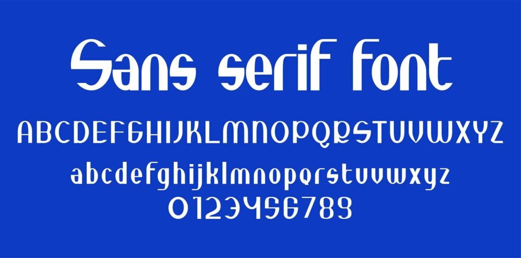
The Ultimate Guide To Choosing Sans Serif Fonts For Your Brand In 2024

FreePik.com
When it comes to branding, the choice of font plays a crucial role in shaping your brand’s identity. A well-chosen font can communicate your brand’s values, personality, and message effectively. In 2024, sans serif fonts continue to be a top choice for brands aiming for a clean, modern, and versatile look. This guide will help you understand how to select the perfect sans serif font for your brand, ensuring that your visual identity stands out in a competitive market.
1. Why Sans Serif Fonts Are Ideal for Branding
Sans serif fonts are known for their simplicity and readability. Unlike serif fonts, which have small strokes at the ends of letters, sans serif fonts are clean and straightforward. This makes them highly legible on both digital screens and printed materials. In a world where clarity and simplicity are increasingly valued, sans serif fonts are the go-to choice for brands seeking a modern and professional appearance.
The appeal of sans serif fonts lies in their versatility. Whether your brand is tech-savvy, minimalist, or creative, there is a sans serif font that can match your brand’s ethos. Their adaptability allows them to be used across various platforms, from https://typetype.org/ websites and apps to business cards and billboards.
2. Understanding Your Brand’s Personality
Before choosing a font, it’s essential to understand your brand’s personality. Is your brand serious and professional, or is it playful and innovative? The font you choose should reflect these characteristics. For instance, a tech company might opt for a font like Roboto, which is known for its modern, digital-friendly design, while a luxury brand might choose a font like Helvetica for its timeless and sophisticated look.
If your brand is creative and bold, you might explore more unique sans serif fonts that offer a bit of character while maintaining simplicity. Fonts like Montserrat, with its urban-inspired design, or Futura, with its geometric precision, are excellent choices for brands that want to make a statement.
3. Key Factors to Consider When Choosing a Sans Serif Font
When selecting a sans serif font for your brand, consider the following factors:
- Legibility: Ensure that the font is easy to read at various sizes. This is particularly important for digital platforms where text might appear small.
- Versatility: Choose a font that works well across different mediums—whether in print, on a website, or on product packaging.
- Personality Fit: The font should align with your brand’s personality. A corporate brand might prefer a clean and neutral font like Avenir, while a more creative brand might choose something like Proxima Nova.
- Scalability: The font should maintain its clarity and aesthetic appeal at different sizes. This is crucial for logos and other branding elements that might need to be resized frequently.
Popular Sans Serif Fonts for 2024
Here are some of the most popular sans serif fonts in 2024 that you can consider for your brand:
- Helvetica: A timeless classic, Helvetica is perfect for brands seeking a clean, professional look. It’s versatile enough to be used across industries, from fashion to technology.
- Futura: Known for its geometric design, Futura is ideal for brands that want to project a modern and forward-thinking image. It’s especially effective in minimalist branding.
- Proxima Nova: A favorite among web designers, Proxima Nova combines a modern aesthetic with excellent readability, making it perfect for digital platforms.
- Montserrat: Inspired by urban typography, Montserrat is great for brands that want to convey a sense of friendliness and approachability.
- Open Sans: Designed for clarity across all devices, Open Sans is a reliable choice for brands that prioritize accessibility and readability.
5. Applying Your Chosen Font Across Your Brand
Once you’ve selected the perfect sans serif font for your brand, consistency is key. Use the font across all brand touchpoints, including your website, social media, printed materials, and packaging. This consistency helps build brand recognition and ensures that your brand’s message is communicated clearly and cohesively.
Experiment with different weights and styles within the font family to create visual hierarchy. For example, you might use a bold version of the font for headlines and a regular version for body text. This approach adds variety while maintaining a unified look.
Conclusion
Choosing the right sans serif font for your brand is a decision that requires careful consideration. By understanding your brand’s personality, considering key factors like legibility and versatility, and selecting a font that aligns with your brand’s values, you can create a strong and memorable brand identity.
To explore a wide range of high-quality sans serif fonts that can elevate your brand, visit https://typetype.org/. Whether you’re launching a new brand or rebranding an existing one, the right font can make all the difference in how your brand is perceived by your audience.


