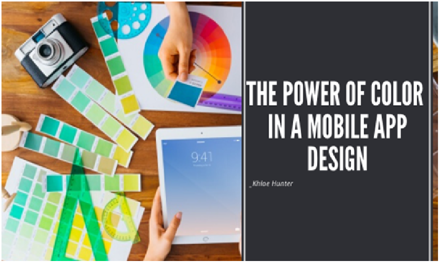
The Power Of Color In A Mobile App Design
If you want to attract more people to your mobile app, it’s essential that your mobile app looks good, has good functionality, and good user experience. The user experience and functionality of a mobile app are no doubt very important elements for a successful app, however, the user interface matters the most.
Why?
Because the initial impression of your mobile app is created by the app design. Essentially, the design is also king. Therefore, it’s imperative that custom app development companies don’t only focus on enhancing the efficiency of the app, they should also stress on choosing the right hues to make it look appealing and beautiful.
If I were to explain all the amazing ways that you can enhance your user interface, it would exceed the limit of this blog post. So in this blog post, I’m going to focus on ‘colors’. I will explain how important colors are, how the selection of your colors can improve your conversion rate, and how you can select the right colors to complement the functionality of your app.
Why Exactly Should I worry about the Colorsof My App Design?
When you’re designing your mobile app you shouldn’t only take into account the ease of use and functionality of your app, it’s essential that you consider the use of colors as well. Because color is something that will create aninstant emotional and subjective impression on the people that view your mobile app. There are numerous studies that show how the use of different tints can influence the behavior of both visitors and customers alike. A colorless mobile app will feel uninteresting and interacting with it will feel like a drag. Whereas an app that incorporates colors will appear more engaging and interactive. Asides the appeal of a mobile app, colorsplay a very important role in communication. Different colors convey a different meaning to the onlookers. For example:
- The color red implies call-to-action and creates a sense of urgency in people.
- The yellow color transmits happiness and a sense of optimism.
- Blue color can be used to generate customer trust and a sense of security.
Above, I’ve only mentioned three colors, every other color conveys its own meaning. So evidently, if you incorporate colors in your mobile app, you will not only enhance its appearance, you will also be able to influence your visitor’s behavior.
Professional Logo Design Company USA
Understanding Color Psychology
In simple words, color psychology is the study of colors and how they can be used to influence human behavior. Each of the primary colors, red, yellow, blue, and green have different effects on human emotions as well as their perception. A study reveals that 92.6 % of people claim that visual presentation is one of the most important factors that affect their purchasing decision. Here are the results I got when I myself asked people to associate particular words with different colors:
Blue: Security, trust, and reliability
Red: Speed and urgency
Orange: Cheap and fun
Yellow: Happy
Black: High quality and technology
With the help of this information, you can choose the right color palette to complement the purpose of your mobile app.
How to Select the Right Color Scheme?
Now let’s get down to the elephant in the room. Understanding how to select the right color scheme for your mobile app.
When you start creating a color scheme for your mobile app, there are a few factors that you have to keep in mind, such as your brand colors and the colors commonly used in your domain.Keep in mind that people are more attracted to simple color schemes that incorporate no more than three colors.Make sure that the colors you select complement each other. If the purpose of your app is entertainment then you should go for more warm tones, on the other hand, if you’re selling something then choose a blue or grayish color scheme to deliver a sense of reliability.
How to Create a Color Scheme?
When it comes to selecting the two or three colors, you can use the color wheel. There are two types of color schemes:
Monochromatic

This is the simplest color scheme that you can create. All you have to do is choose a primary color and select from its different hues.
Analogous

Analogous color schemes are created by selecting related colors of a primary color in the color wheel. One color is selected as the dominant color and others are used to enrich the scheme.
If you’d like to add something feel free to leave a comment below. We would love to hear from you.
Author Bio:
Khloe Hunter is a Digital Marketing Executive for Appverticals. Her expert writing skills enable her to convert complex information into content that anyone can read. Her technical educational background, combined with know-how of content marketing, gives her an edge over others in a variety of blog posts.