What Happened When I Turned Static Photos Into Moving, Stylized Content
I’ve spent enough time working around websites, content pages, and visual assets to know one thing: still images rarely carry the full weight anymore. A clean image can catch the eye, sure, but on a modern page—especially one built around digital marketing, design, or creative storytelling—it often needs a second layer of life. That is part of why I started testing an image to video generator in my own workflow. Aik Designs regularly covers technology, digital marketing, web design, and AI, so a hands-on experiment like this feels like a natural match for readers who are already interested in practical, creative tools.
What surprised me was not the “wow” factor. It was how quickly a flat asset became more useful.
I did not begin with polished campaign art or studio shots. Most of what I tested were ordinary images: a portrait, a product mockup, an illustrated character concept, and a few experimental visuals that I would normally leave sitting in a folder after one use. Once I started turning those into short motion pieces, I noticed a change in how I evaluated images in the first place. I was no longer asking, “Does this still image look good?” I was asking, “Can this image carry attention for five to eight seconds without falling apart?”
That small shift changed how I created.
A Still Image Has Limits—Motion Changes the Job
When I use static visuals on a landing page, in a blog, or in social posts, they do one job: stop the scroll. Motion does something different. Motion holds attention long enough for a message to land.
That does not mean every image needs to become a video clip. In practice, I found that certain images were much better suited for motion than others:
| Image Type | Worked Well in Motion? | Why |
| Portraits with clear subject separation | Yes | The movement feels natural when the subject is easy to isolate |
| Product visuals on simple backgrounds | Yes | Small camera motion adds polish without distracting |
| Busy collages with too many focal points | Not really | The result often feels messy or confused |
| Stylized character art | Very well | Motion adds mood and personality quickly |
The strongest results came from images that already had a clear visual anchor. If the eye knows where to look, even light motion—subtle zoom, background drift, a little depth—can make the content feel more intentional.
That became even more obvious when I moved into anime-styled content.
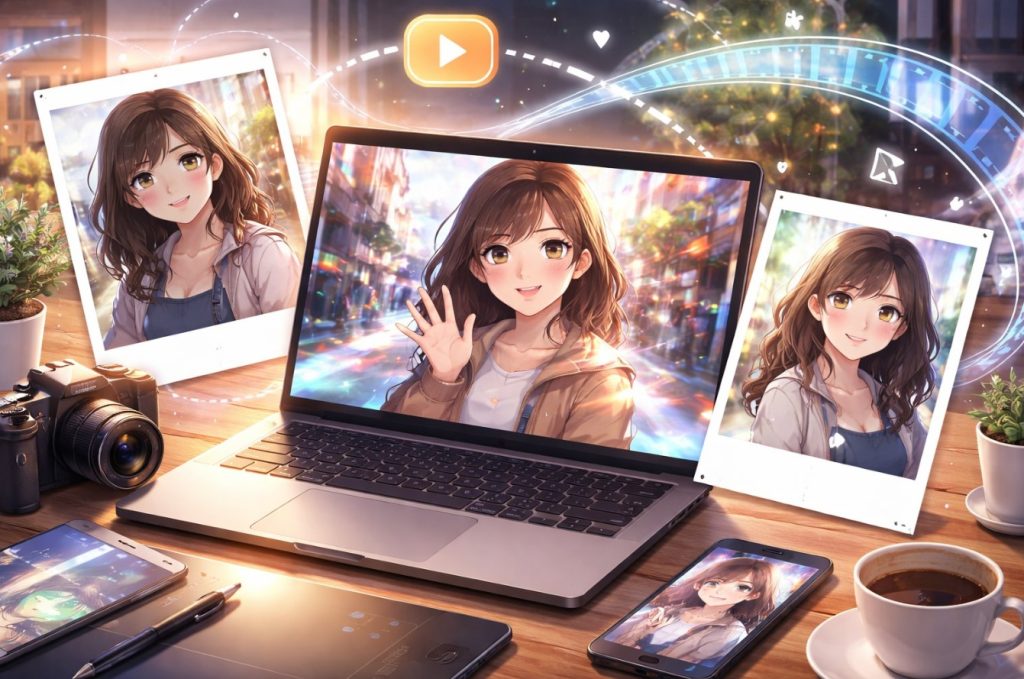
Where “Photo to Anime” Stops Feeling Like a Gimmick
I’ve seen plenty of novelty-style effects come and go, so I was skeptical at first. A lot of them are fun for five minutes and useless after that. But when I started working with photo to anime, I found it was more practical than I expected.
The key was not treating it like a joke filter.
Used casually, it is just a transformation effect. Used carefully, it becomes a style bridge. I could take an ordinary portrait, convert it into something more illustrated and expressive, and then build a short motion piece around that result. Suddenly, the asset was not just a “before and after” novelty. It became usable for creator branding, character-led content, profile visuals, or stylized promo material.
That matters because stylization solves a real problem: not every project benefits from photorealism. Sometimes realism feels too plain. Sometimes it feels too corporate. An anime-inspired output can soften that, create a more recognizable identity, and make the content feel less like stock media.
I found this especially useful when I wanted content that felt personal without being overly literal. A direct portrait says, “Here I am.” A stylized version says, “Here is the version of me I want this project to communicate.”
That distinction is small, but in branding, small distinctions do heavy lifting.
What Actually Made the Results Better
After enough tests, I stopped blaming the tools every time a result looked weak. More often than not, the issue was the source image or my expectations.
A few patterns kept showing up:
Clean inputs gave me better motion
Images with cluttered backgrounds, awkward crops, or muddy lighting usually produced weaker clips. Once I started feeding cleaner source images into the workflow, output quality improved fast.
Style worked best when it had a purpose
The anime conversion looked strongest when I already knew why I wanted it. If I was aiming for a character-led visual identity, it worked. If I used it randomly just because it looked “cool,” the content usually felt shallow.
Short clips were more convincing
I got more reliable results from shorter sequences than from trying to force too much movement. A restrained five-second clip often looked more polished than a longer one with unstable details.
Subtle motion beat dramatic motion
This was probably the biggest lesson. I expected bold movement to look more impressive. In reality, restrained motion felt cleaner, more premium, and easier to place inside a real page or campaign.
That last point changed how I think about creative tools in general. People often chase maximum effect. I’ve had better results chasing controlled effect.
Why This Goes Beyond a Simple Creative Test
The reason I kept using this workflow was simple: it solved practical problems.
A single asset could stretch further. A portrait could become a stylized version, then become a moving clip, then serve as a hero visual, a teaser post, or a supporting visual inside an article. That kind of reuse matters when you are publishing regularly and do not want every piece of content to feel visually recycled.
It also made concept testing faster. Before committing to a larger design direction, I could try a stylized look, add motion, and quickly judge whether the tone felt right. That is useful when you are working on creative pages, campaigns, or brand content where mood matters as much as clarity.
And maybe that is the real takeaway. These tools are not valuable because they are flashy. They are valuable when they help one asset do more work without making the result feel cheap.
My Honest Rule for Using This Well
I would not use every effect on every image. I would not force anime styling into projects that need a formal tone. I would not turn motion into noise just because the tool can generate it.
But when the visual goal is personality, energy, or a more distinctive identity, this combination is genuinely useful.
What worked for me was a simple sequence:
pick a strong source image, decide whether stylization adds meaning, keep the motion restrained, and judge the result by whether it feels usable—not merely impressive.
That last test is the one I trust now.
Because in real content work, the best creative tool is rarely the one that produces the loudest result. It is the one that helps you publish something sharper, more memorable, and easier to use again.